What is design QA? A plain explanation for websites
Design QA is a term that shows up in project plans and agency proposals without much explanation. The meaning is simple. Before a client sees a new website, someone compares the built pages with the approved design and lists every place where they don't match. This article covers what design QA means, how it differs from bug testing and UAT, who usually does it, and a short checklist you can use on your next build.
What design QA means
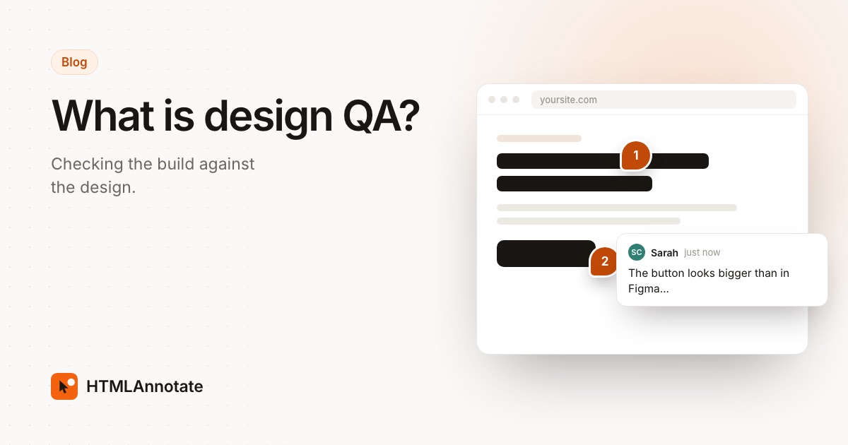
QA stands for quality assurance. Design QA is the slice of it that deals with how the site looks and behaves on screen. A designer hands over a design, usually in Figma or a similar tool. A developer builds it. Somewhere between the two, small differences creep in: a heading is 32 pixels instead of 36, a button has the wrong corner radius, the gap under the hero is half what it should be, the hover colour was never added. Design QA is the step where someone goes looking for those differences on purpose and writes them down.
None of these is a bug in the usual sense. The page loads, the links work and the form submits. But a site built with a dozen small mismatches looks less finished than the design the client approved, and clients notice that even when they can't say what's wrong. Our website feedback glossary has a one-line definition if you need to explain the term to someone quickly.
Design QA covers more than the static layout. It includes states and behaviour that a design file often shows separately or not at all: hover and focus styles, open menus, form errors, empty states, loading states, and how the layout changes between phone, tablet and desktop widths.
How design QA differs from bug testing and UAT
Three kinds of checking happen on most website projects, and people use the names loosely. The difference is in the question each one asks.
| Design QA | Bug testing | UAT | |
|---|---|---|---|
| The question | Does it match the approved design? | Does it work? | Can the client do what they need, and will they accept it? |
| Usually done by | The designer | Developers or a QA tester | The client and people who will use the site |
| Compared against | The design file and style guide | Expected behaviour and requirements | The client's real tasks and goals |
| Typical finding | Card titles use the wrong font weight on tablet | The contact form doesn't send on Safari | The sales team can't find where enquiries go |
| When | After each page is built, before the client sees it | Throughout the build and before launch | Last, just before launch, ending in sign-off |
Bug testing, often just called QA or functional testing, checks that things work: links go to the right place, forms send, nothing breaks in a particular browser, pages load at a reasonable speed. A page can pass every functional test and still fail design QA, because a working button in the wrong colour is still a working button.
UAT, or user acceptance testing, comes last. The client, ideally with a few of the people who will run the site day to day, goes through real tasks and decides whether to accept the build. We cover it in more detail in what UAT means for websites. If design QA has been skipped, UAT tends to fill up with spacing and colour comments, and the client's attention goes there instead of to content, wording and whether the site does its job.
In practice the three overlap. A designer doing design QA will spot broken links, and a client in UAT will mention a misaligned image. That's fine. The point of separating them is that each one has an owner and happens at a sensible time, so nothing important is left to chance.
Who does design QA
The best person is usually the designer who made the design. They know which details were deliberate, which spacing values belong to the system and which were one-off adjustments, and how the layout was meant to adapt between screen sizes. They can also tell a meaningful difference from one that doesn't matter.
That last part is the real skill. A design file shows a few fixed widths. A browser renders every width in between, with real text, real images and fonts drawn slightly differently on each system. Some differences are unavoidable or harmless. Good design QA separates "this is wrong" from "this is different, and fine", and doesn't send the developer a hundred comments about single pixels.
Other set-ups also work:
- A project manager with a good eye, working from the design file and a short list of what to check.
- A second developer, who reads the design with fresh eyes and isn't checking their own work.
- A small team splitting it by template: one person takes the homepage and landing pages, another takes the blog and forms.
The developer who built the page is the weakest choice for the main pass. They will check against what they think the design says, which is exactly where the mismatches came from.
When design QA happens in a project
Most teams do design QA in two passes. The first is light and happens during the build, component by component: the header, the card, the button set. Catching a wrong type scale at this stage fixes it everywhere at once. The second is a full pass on the staging site once pages are assembled, at every screen size, with real content in place.
Both passes come before the client review. The order matters for a practical reason: the client should be judging the site, and they can only do that well when the build already looks like the design they signed off. It also protects revision rounds. Every spacing fix the client has to request is a fix the team could have made before they saw it.
A short design QA checklist
Open the design file next to the staging site and work through each template at desktop, tablet and phone widths. Check:
- Spacing: gaps between sections, padding inside cards and buttons, alignment to the grid.
- Typography: font family, size, weight, line height and letter spacing for each heading level and body text. Look for headings that wrap badly at in-between widths.
- Colour: text, backgrounds, borders and buttons match the design's palette, including tints and opacity.
- Images and icons: right crop, right aspect ratio, sharp on high-resolution screens, consistent icon sizes and stroke weights.
- States: hover, focus, active and disabled styles on links, buttons and form fields. Form error and success messages.
- Components that open or move: menus, accordions, tabs, modals, carousels and any animation timing that was specified.
- Responsive behaviour: what stacks, what hides and what resizes between breakpoints, and that nothing overflows sideways on a phone.
- Content edge cases: long headings, short headings, a card with no image, a name that wraps to three lines.
Visible focus styles and colour contrast are design details and accessibility requirements at the same time. If you want to go further than a glance, our guide to collecting accessibility feedback covers quick checks anyone can run.
How to write design QA comments
A design QA comment should let the developer fix the issue without opening the design file to work out what you meant. Include the element, the screen size, what it is now and what it should be, with the exact value when you have it. "Card title on tablet is 18px regular, should be 20px semibold" is fixed in a minute. "Card titles look off" starts a conversation.
Keep one issue per comment, and say when something repeats across a template so the fix happens once. For more on writing feedback people can act on, see how to give good website feedback.
Running design QA on a review link
HTMLAnnotate is a tool for leaving comments directly on a web page, and design QA is one of the jobs it fits. Paste the staging address, or upload a single HTML file, and you get a review link. The real site runs on that link, scripts included, so menus, hover styles and forms behave as they do in a browser.
- Click the element that's wrong and write the comment there. The developer sees exactly which heading or button you mean.
- Desktop, tablet and phone views each keep their own comments, so a spacing issue that only appears on a phone stays with the phone view.
- Tag design issues with the Design label to keep them apart from bugs and copy changes, and use a suggested text edit when the fix is a wording change.
- Each comment records the browser, system and window size it was left from, which helps when a font renders differently on one machine.
- Mark items resolved as the developer fixes them. When the list is empty, the build is ready for the client.
Reviewers don't need an account or an extension. You can try it on a sample site in the live demo, or start a review link for your own staging site. When design QA is done and the client has signed off, our website handover checklist covers what to pass over at the end of the project.
Questions
What does design QA stand for?
QA stands for quality assurance. Design QA is the part of quality checking that looks at the visual design and interaction: whether the built pages match what was designed and approved, on every screen size.
Is design QA the same as visual testing?
They overlap. Visual testing often means automated screenshot comparison, where software flags pixel changes between two versions of a page. Design QA is usually a person comparing the build with the design file and judging which differences matter. Some teams use both: automated checks catch unexpected changes later, and a designer does the first review by hand.
Who should do design QA on a website project?
Ideally the designer who made the design, since they know what was intended and which details carry weight. On small teams a project manager or a second developer can do it with the design file open next to the build. The developer who built the page is the weakest choice, because it's hard to spot your own misreadings.
When should design QA happen?
After a page or template is built and before the client sees it. Many teams also do a quick pass per component during the build, then a full pass on staging before the client review. Doing it before UAT means the client spends their time on content and decisions, not on spacing.
Does design QA mean the site must match the design pixel for pixel?
Usually no. A design file shows a few fixed screen widths, while a real browser renders text and images at every width in between. The goal is that the build follows the design's rules for spacing, type, colour and layout, and that any deliberate change has been agreed. Teams that want an exact match should say so up front, since it takes more time.
Run your next design QA round on one link. Click the element that's off, say what it should be, and track every item to resolved.
Start a free review