How to give useful website feedback
Someone has sent you a website to review. This guide is for you, the reviewer. Five minutes of reading turns notes like "make it pop" into comments a designer can fix the same day. Agencies: send it along with your review links.
Before you start
- Know what this round is for. A first round is about structure and content. A late round is about polish. Ask if you aren't sure, so you don't spend an hour on wording that is still a first draft.
- Set aside one sitting. Feedback sent in one batch is easier to act on than ten emails over a week.
- Look at it the way a visitor would. Start at the top of the home page and click through like a first-time customer, then go back and look closely.
1. Point at the exact thing
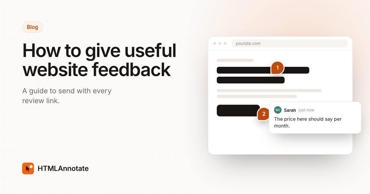
"The section near the bottom" can mean three different things. If your review link lets you click the page to comment, click the heading, button or photo you mean and type there. The comment stays attached to it, so nobody has to guess.
2. One point per comment
A comment that says "fix the font, swap the photo and the phone number is wrong" is three jobs in one. Split it into three comments. Each can then be fixed, checked and marked done on its own, and nothing gets lost.
3. Say what you see, why it matters, and what you want
This is the whole trick. Most unclear feedback is missing one of the three.
| Instead of | Try |
|---|---|
| "Make it pop." | "The headline gets lost on this photo. Could it be bigger, or the photo darker behind it?" |
| "I don't like the colours." | "The green feels cold next to our logo. Could we try the warmer orange from our brochure?" |
| "This is confusing." | "I didn't know this button would take me to pricing. Could it say See pricing?" |
| "Fix the text." | "Change 'We offer solutions' to 'We repair bikes in central Leeds, same day.'" |
| "Looks weird on my phone." | "On my iPhone the menu covers the first heading." |
4. Write the words you want
If the wording is wrong, suggest the exact new wording. Your designer can paste it in, and you get what you meant. Some review tools let you suggest a text edit right on the page, which shows the old and new words side by side.
5. Check it on your phone
Most visitors will see the site on a phone, and the layout there is different: menus fold away, columns stack and images crop. Open the review link on your phone, or switch the review page to its phone view, and leave those comments there so they don't get mixed up with desktop notes.
6. Mark what must change
Not every note is equal. Say which comments must be fixed before launch and which are ideas for later. "Must fix: the phone number is wrong" gets done first. "Nice to have: a photo of the team here" can wait.
7. Separate taste from facts
A wrong price, a broken link or a typo is a fact. A colour you don't love is taste, and that is fine to say, as long as you say why. If several people in your company are reviewing, agree among yourselves first, so the designer doesn't get two opposite instructions.
8. Approve it when you are happy
When the page is right, say so clearly. If your review link has an Approve button, press it. A clear approval lets the team move on, and it means everyone agrees which version went live.
A checklist for every review
- Click through the whole site once like a visitor before commenting.
- Every comment points at one exact thing.
- Each comment says what you see, why, and what you want.
- Wording changes include the new words.
- Prices, phone numbers, addresses and opening hours are checked.
- Every link and button goes where you expect.
- The site is checked on a phone.
- Must-fix comments are marked.
- You approved it, or said what is left.
For agencies: send this with your review links
Clients rarely know what good feedback looks like, and few were ever told. Link this page in the email that goes with your review link, or paste the checklist in. For the email itself, see how to get feedback on a website, and for the final step, getting client sign-off.
Questions
What makes website feedback useful?
Useful feedback points at the exact element, says what is wrong and why, and suggests what you would like instead. One point per comment, so each one can be fixed and ticked off on its own.
Should I comment on the phone layout separately?
Yes. Most visitors will see the site on a phone, and the layout there is different. Open the review link on your phone, or switch to the phone view if the review tool has one, and leave those comments there.
How do I give feedback on wording?
Write the new words, not just that the words are wrong. If you can, suggest the exact sentence. A designer can paste your version, but can't guess what you had in mind.
Is it OK to say I don't like something?
Yes, as long as you say why. "I don't like this photo, it feels too corporate for us" gives the designer something to work with. "I don't like it" on its own doesn't.
How many rounds of feedback should a website take?
Most agencies plan for two or three rounds. Grouping every comment into one round, instead of sending notes as you think of them, keeps it to that.
Agencies: send your next review with HTMLAnnotate. Clients click anything to comment, with no account.
Start a free review