What to do with vague client feedback like "make it pop"
"Can you make it pop?" "It feels a bit off." "I'll know it when I see it." Every designer has had these. The client isn't being difficult: they can see something is wrong but don't have the words for it. Your job is to help them find the words, quickly and without guessing.
Why feedback comes out vague
Clients react to the whole page at once. They notice that something feels wrong long before they can say why. They also don't share your vocabulary: "contrast", "hierarchy" and "white space" are designer words. So they reach for phrases that describe a feeling, and leave you to work out the fix.
Guessing is the expensive response. You spend an afternoon on your best interpretation, send it back, and hear "not quite". The cheaper response is a few good questions.
What common phrases usually mean
| They say | Often means | Ask |
|---|---|---|
| "Make it pop" | Nothing stands out; low contrast; no clear focal point | "What should someone notice first on this page?" |
| "It feels off" | Misaligned elements, uneven spacing, mixed fonts | "Which part does your eye keep going back to?" |
| "Too busy" | Too many elements competing; too many colours or font sizes | "If we kept only three things here, which three?" |
| "Too plain" or "boring" | Not enough personality; no imagery; flat colour | "Is there a site you like that feels right?" |
| "Make it more modern" | Dated fonts, heavy shadows, cramped spacing | "Can you send one or two sites that feel modern to you?" |
| "Make it more professional" | Inconsistent spacing, playful fonts, low-quality images | "Which part feels least professional?" |
| "The logo should be bigger" | Brand doesn't feel present enough | "Is it the logo itself, or that the page doesn't feel like your brand?" |
| "I don't love it" | Anything at all | "What's the first thing you'd change?" |
These are starting points, not rules. The same phrase can mean different things from different people, which is why the question column matters more than the middle one.
Three questions that work for almost anything
- Where? "Which section or element are you thinking of?" Half of vague feedback is about one specific thing the client didn't name.
- Compared with what? "Is there a site or a section that gets this right?" A reference is worth a page of description.
- What should it do? "What would you like a visitor to feel or do here?" This moves the conversation from taste to goals, which is easier to agree on.
Keep it short and friendly. A reply like "Happy to. Quick question so I get it right first time: which part caught your eye?" lands better than a list of ten questions.
Show options instead of explaining
When words aren't working, make two or three fast variations of the section in question: one with more contrast, one with less going on, one with a bolder headline. Clients who can't describe what they want can almost always pick it out. Keep the variations rough; the point is direction, not polish.
Preventing vague feedback in the first place
- Agree goals before design. Who the page is for and the one action it should drive. Later feedback can be checked against that.
- Collect references early. Three to five sites the client likes, and what they like about each.
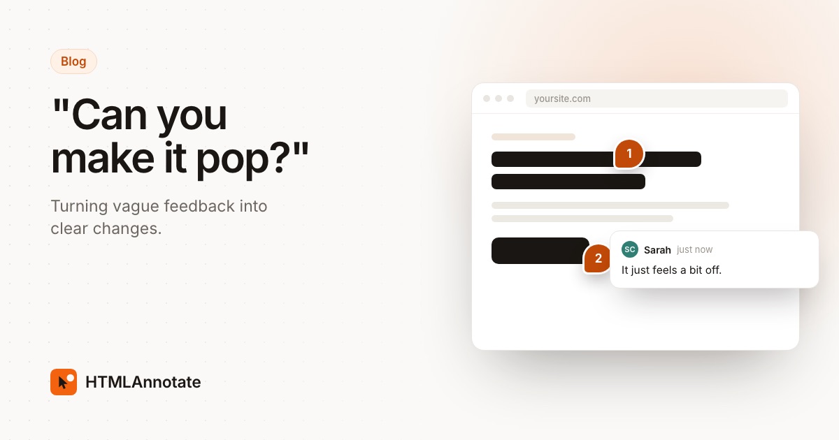
- Ask for comments on the page itself. When clients click the exact headline or button they mean, "the thing near the top" disappears. A short guide to giving useful feedback helps too.
- Ask them to check the phone view. Many "feels off" comments are really about the mobile layout.
- Limit the rounds. A set number of revision rounds in the proposal makes each round more considered.
Replies you can borrow
- "Thanks, that's useful. When you say it should pop, which part would you like people to notice first?"
- "Got it. Is there a site you've seen recently that has the feel you're after?"
- "I've made two quick versions of the header. Which is closer?"
- "Could you click the part that feels off on the review link and leave a note there? Then I'll know exactly where to look."
For the email side of the process, see our feedback request email templates.
Questions
What does "make it pop" mean in design feedback?
Usually that nothing on the page stands out. It most often means more contrast, a bolder headline, a stronger colour on the main button, or a clearer single focal point. Ask which part they want people to notice first.
How do I respond to vague client feedback?
Thank them, then ask short specific questions: which section, compared with what, and what they would like a visitor to feel or do. Offer two or three concrete options rather than one guess.
How do I stop getting vague feedback?
Agree goals before design starts, collect reference sites the client likes, ask for comments pinned to the exact element, and give clients a short guide on giving useful feedback.
What if the client can't explain what they want?
Show options. Two or three quick variations of the section usually get a clear "that one" faster than any amount of discussion.
Should I just make my best guess?
Only for small changes. For anything that takes more than a few minutes, a short question saves a wasted round.
Let clients point at the exact thing they mean. Send a review link where they click the page to comment, with no account.
Start a free review